Skip to content

DavidJames.Africa

Brand · 2024 · DavidJames.Africa (freelance)

DavidJames.Africa came to me for a rebrand. The brief settled on three words, human, innovative and African, and the mark is built from all of them: a fingerprint, a ripple, and the outline of the continent in one shape.
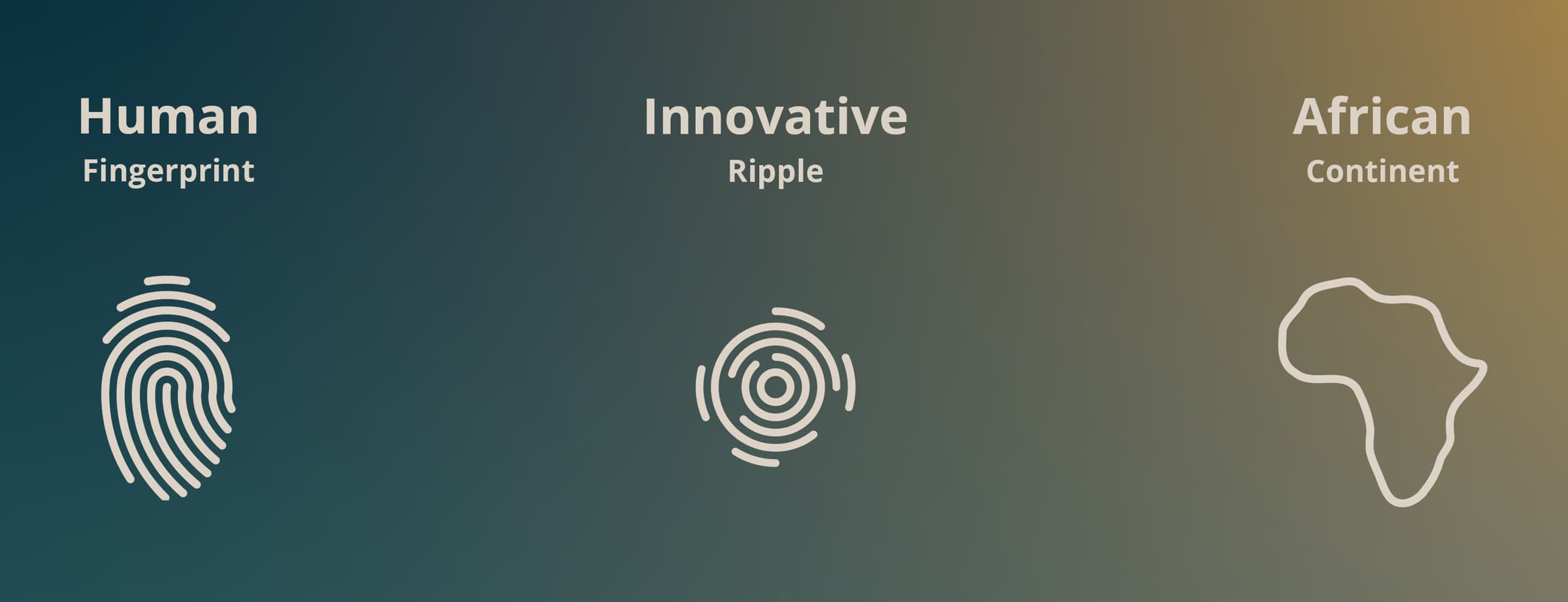
The three ideas behind the mark: a fingerprint for human, a ripple for innovative, the outline of the continent for African
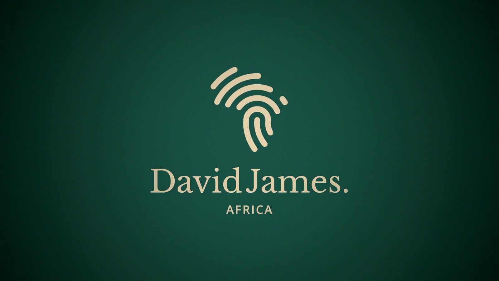
The finished mark embossed in gold on a deep teal card

I drew the logo as a full lockup, a wordmark and a set of submarks so it still holds at favicon size. Two typefaces, five colours.
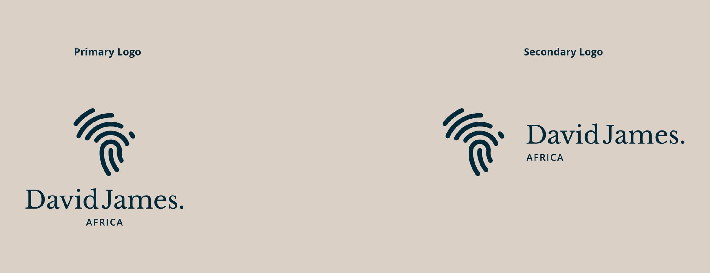
The primary and secondary logo lockups in indigo on alabaster
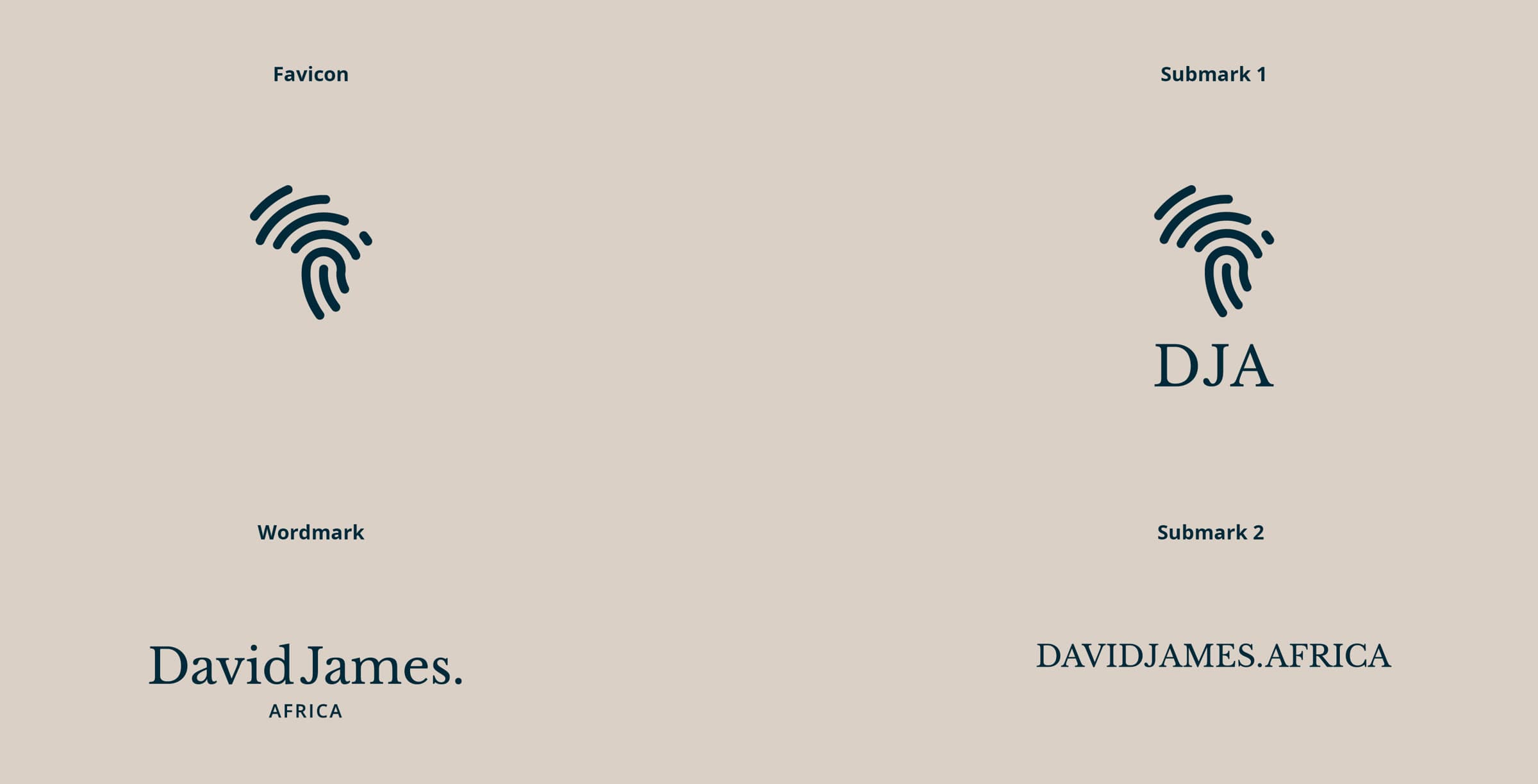
The rest of the suite: favicon, wordmark, a DJA submark and a DAVIDJAMES.AFRICA submark
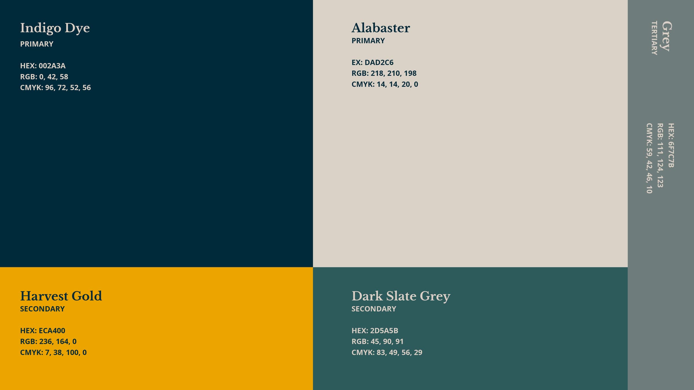
The palette: Indigo Dye and Alabaster as primaries, Harvest Gold and Dark Slate Grey as secondaries, with a grey tertiary
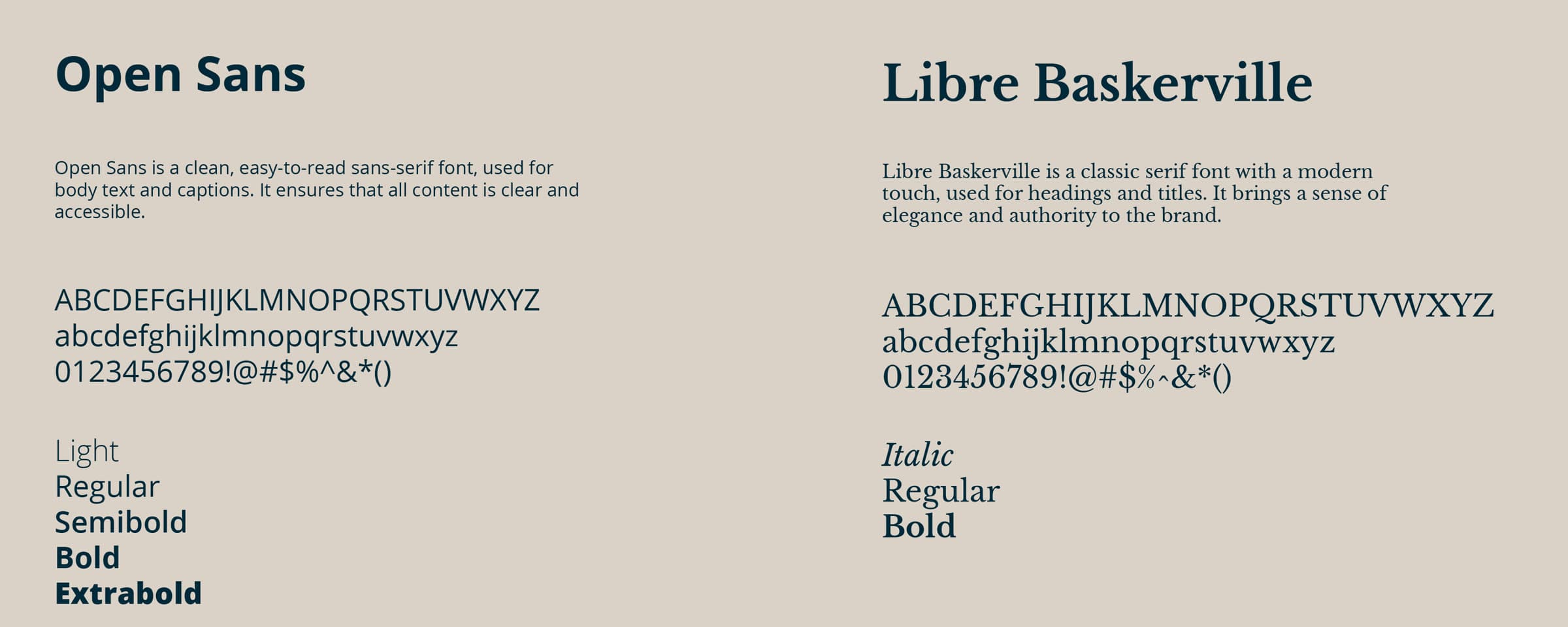
The type system: Open Sans for body, Libre Baskerville for headings
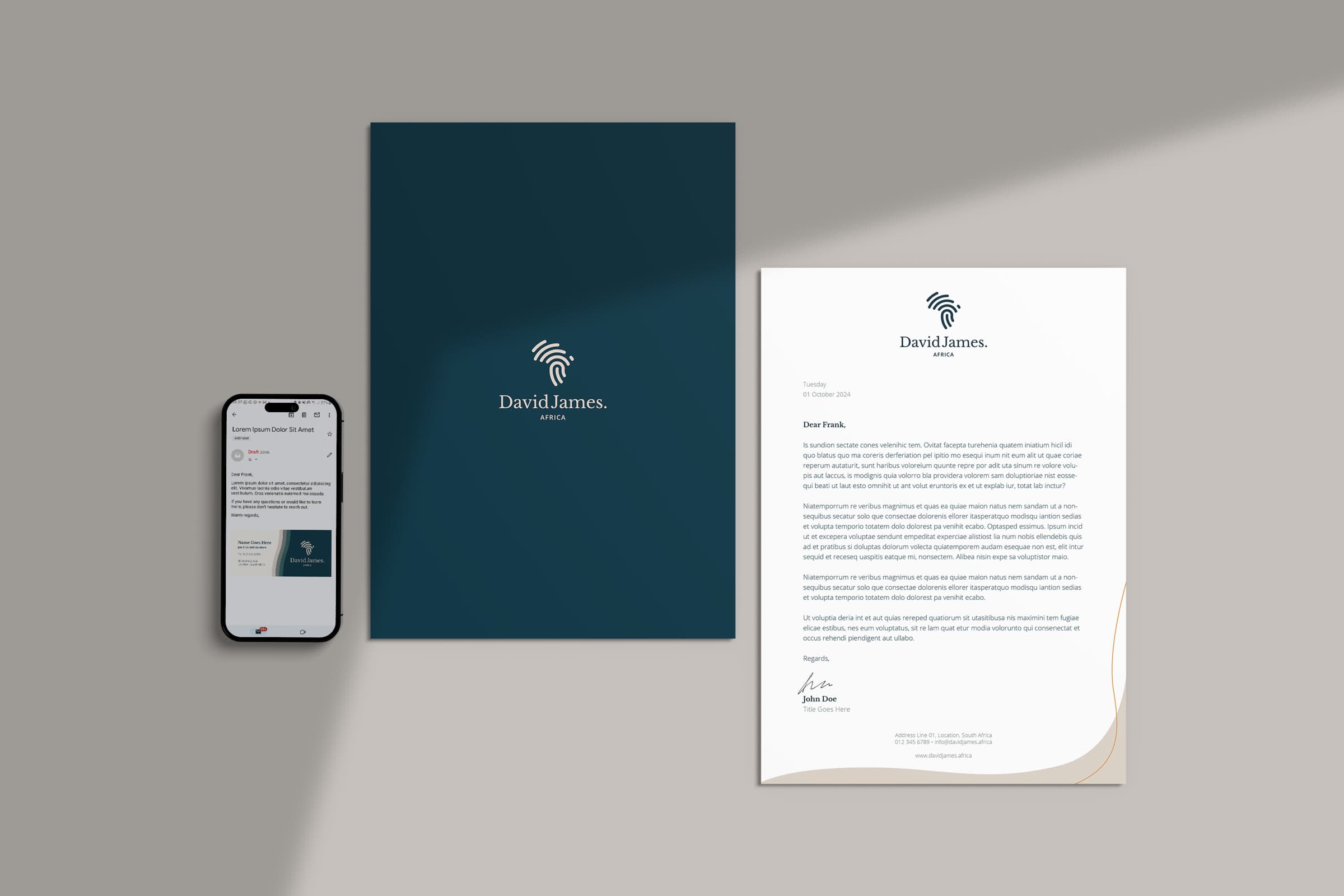
Stationery: business card, letterhead and an email signature on a phone

Next project

Stories of Recovery

Tell me what you’re working on.

Start a conversation

Open to remote and Durban-based work